-
tiltin
Dear Support, hoping for some of your wisdom and advice;
We’re (still) experimenting with large featured images like https://curvspace.com/walkways/, originally pre-sized and optimized, and not use the ‘Hero Image Module’.
Goal is to collect and show relevant portraits and landscapes with lots to see, and pull viewers in (challenge I know).
That image speed score looks fine https://pagespeed.web.dev/analysis/https-curvspace-com-walkways/j2z51vwkvm?form_factor=mobile.
Google (https://developer.chrome.com/docs/lighthouse/performance/uses-responsive-images/?utm_source=lighthouse&utm_medium=lr) says: “Ideally, your page should never serve images that are larger than the version that’s rendered on the user’s screen.”
So if we simply upload the original size image as WebP to library, and insert it to post; do we then serve images like Google wants?
And generally would you say ours a ‘wise’ endeavour to show these large featured images? Is there some rule that says ‘don’t ever serve large images’. Or can we optimize large images like we’re doing without sacrificing technical performance?
Thank you!
-
David
Hi there,
when you upload an image to your Media Library, WordPress generates several smaller size versions of the image. Medium, Medium Large and Large.
And these sizes are all provided to the browser in theimgHTMLsrc-set
And the way your site is set up ie. the large image fills the width of the viewport on smaller screens, is absolutely perfect for the browser to use those smaller sizes as necessary.So simply put, the size of the images you’re using absolutely fine as the src-set is handling responsive sizing for you.
-
tiltin
Much obliged again David, we’ll stick to making this work
-
David
You’re welcome!
-
tiltin
Hi David, would you mind helping me along some more for images optimizations for https://pagespeed.web.dev/
Post pages on https://curvspace.com/ have very large stock-images, all optimized and around 300kb in WebP.
All post pages I sppedtested got scores above 90%.
But the homepage test tells me we need to resize every thumbnail.
How should I approach this?
Thank you
Bert -
Try this PHP Snippet:
function db_modify_srcset_sizes($sizes, $size) {
    if ( !is_single() ) {
        $sizes = '(max-width: 420px) 300px, (max-width: 1024px) 768px, 100vw';
    }
    return $sizes;
}
add_filter('wp_calculate_image_sizes', 'db_modify_srcset_sizes', 10 , 2);
the
wp_calculate_image_sizesfilter hook allows you to change thesizesattribute of the HTML img that WP outputs. By default it will return something likes this:sizes="(max-width: 1152px) 100vw, 1152px"Which effectively uses the max size image , it works great if the image fills the width of the viewport, as the browser will then just choose the best size image available, as you see with your single post. But in this case its terrible.
So the code above will apply to any NON single post, and rewrite the sizes to:
(max-width: 420px) 300px, (max-width: 1024px) 768px, 100vwSo on small sub 420px wide devices, it will advise the browser to use the 300px image, on sub 1024px devices to load the 768px wide image, and anything above that size just do the normal thing.
-
tiltin
Thank you David, mobile scores above 90%!
-
Awesome – glad to be of help
-
tiltin
Hi David, could we have another go at this, our current setup still requires hand-resizing (we use https://squoosh.app/).
And now we lost full screen-width featured landscape images on laptops, because we need to resize to about 1100px on post-pages (while full-width is about 1400px I believe), to get green scores for homepage thumbnails.https://pagespeed.web.dev/analysis/https-curvspace-com/42weflgr7n?form_factor=mobile (not green now).
And I was hoping for a more automated/coded solution that achieves green scores for our homepage thumbnails. Our very large full-width post-page featured images still score green https://pagespeed.web.dev/analysis/https-curvspace-com-walkways/21f1ycym7x?form_factor=mobile .
So now I’m unsure if your original instructions can achieve this and we applied it wrong or if I misexplained, maybe you could login and assess whats what please?
-
tiltin
Logins:
-
Have you enabled any image optimizer that is converting the images to
webp? -
tiltin
Thank you David, we stopped using plugins for this and started editing images externally on https://squoosh.app/ including conversion to webP. To my knowledge no internal special tool is doing anything to images.
-
The snippet i provided here:
https://generate.support/topic/image-size-vs-pagespeed/#post-95379Is that still added to the site?
If it is, then i assume the Litespeed cache and lazyloader is breaking that code, as i don’t see any src-set images or that codes work in your HTML -
tiltin
Developer tried and then went his own way (I lost control and got confused).
I remember RankMath adding some tag to featured images, signalling to Google this is a large 1250px+ image for serps.
I’ve no way of assessing current status, and I understand and support GP policies, but this is our last obstacle that really impacts our workflow to go live (we’re already ranking and haven’t even started publishing for real). We had everything working and now we’re back to start 🙁
If we can’t get your original plan to work I’ll be satisfied to organize for handwork, but I would give almost anything if you could access the site and try to make this work. I could invite developer back, but I fear it could set us back even further.
-
There isn’t much we can do regarding the resizing of the images, if you need to resize each image then it will require handwork.
My concern is regarding the other changes we help you with.
As they are no longer working, and that looks to be related to some image optimizations – perhaps the developer can explain what he did there ? -
tiltin
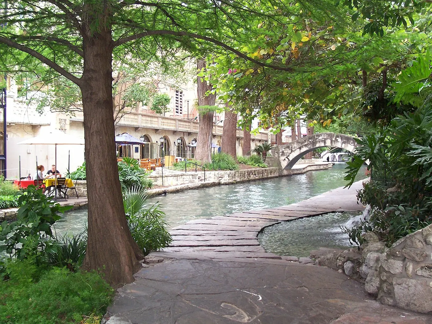
I understand David, we want to resize by hand (if neccessary) to get screenwide (minumum 1350px) featured images like this one https://curvspace.com/wp-content/uploads/2023/11/Walkway-alongside-city-canal.webp which is 1400px and scores great https://pagespeed.web.dev/analysis/https-curvspace-com-walkways/alo0lwke4d?form_factor=mobile. 1400-1600px is a pretty standard size for stock imagery (just need to convert to webP).
We dont want to resize to non-screenwide landscapes, because the homepage scores bad with their thumbnail-versions. Ie. we dont want to have to sacrifice post page aesthetics for homepage speed.
Does that make sense you think?
- You must be logged in to reply to this topic.